

Tonal Embroidery on Hoodies: Choosing Your Level of Contrast
You have chosen the initials, the word or the little symbol. Then comes a decision that can change the whole mood of the garment: should the thread blend into the fabric or stand apart from it?
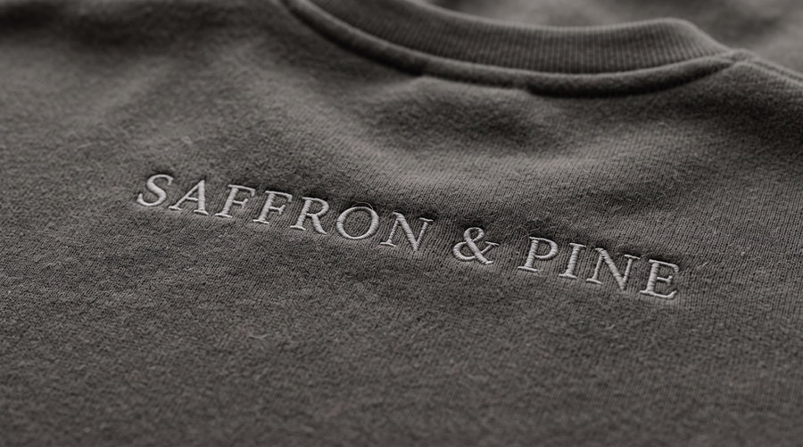
Tonal embroidery on hoodies keeps the thread close to the garment's colour, creating a quieter visual effect. Contrasting embroidery makes the design more immediately noticeable. Neither approach needs a complicated motif to feel considered.
For anyone building a personal wardrobe in Canada, the useful question is how the finished piece will fit into everyday outfits. Here are three ways to think through the choice, followed by a simple comparison exercise you can use before approving your design.
First, think of contrast as a range
You do not have to choose between an almost invisible detail and a brilliant white logo on black. There is plenty of room between those extremes.
Imagine a charcoal hoodie with dark grey initials, then the same hoodie with soft grey initials, and finally with cream initials. Each pairing asks for a different amount of attention. The middle option may suit someone who wants the lettering to be legible without making it the first thing you notice.
Use words such as “close in colour,” “gently visible” or “clearly contrasting” when describing your preference. They give the design conversation a direction. Exact garment and thread combinations still need to be confirmed; a colour idea is not a promise that a particular match is available.
Scenario one: the detail you mostly wear for yourself
Picture someone whose wardrobe is built around dark jeans, simple coats and familiar neutral layers. They want a small personal mark on a hoodie, but they rarely choose clothing with prominent lettering.
A tonal direction is a useful starting point. The embroidery can be part of the garment's overall surface rather than the main focus of an outfit. A short word or compact set of initials lets the personal meaning remain central without asking everyone else to read it.
The trade-off is worth considering honestly: would you feel pleased by a detail that people notice only occasionally, or disappointed that the design is less obvious? There is no need to choose subtlety because it sounds sophisticated. Choose it because that is how you want to wear the piece.
Scenario two: the small design that completes the outfit
Now imagine a black hoodie worn with pale denim or a cream jacket. A light embroidered mark could echo a colour already present elsewhere in the outfit. The motif becomes a deliberate accent.
This is where contrast can feel useful even for someone who prefers simple clothes. You can keep the design compact and let the colour difference do the visual work. A clearly defined monogram may give you all the emphasis you want without adding more words or a second motif.
Try describing the outfit as a whole. “Black hoodie, light trousers, cream initials” is a clearer styling idea than “make the embroidery pop.” It also helps you decide whether the colour belongs in your usual wardrobe or only in the image you are currently imagining.

Scenario three: the design people need to recognise
Some embroidery has a job beyond personal expression. You might want a club name to be easy to identify in a group photograph, or a small business mark to remain noticeable when someone is speaking with a customer.
In that case, begin with visibility as a requirement. Ask to see how the proposed colour pairing reads at the intended design size. A combination you love in a close detail image may not communicate the same way when you look at the whole garment.
Consider the words as well. Recognising a familiar symbol and reading an unfamiliar name are different tasks. If the text needs to be understood, give the reviewer that context instead of choosing the quietest colour first and hoping the wording will remain clear.
Compare one variable at a time
When comparing previews, keep the garment, artwork, dimensions and placement the same. Ask for two or three thread-colour directions within that shared layout. Otherwise, you may find yourself choosing a larger design or a different hoodie without realising that colour was supposed to be the decision.
Look first at the full garment, then at the detail. Which version feels balanced with the outfit you have in mind? Which one gives the words the prominence you intended? If you are buying a gift, answer those questions from the recipient's perspective.
For a broader explanation of layout and lettering decisions, our custom embroidery design guide covers the steps that come before this colour comparison.
Turn your preference into a clear approval
Once you favour a direction, ask how the final thread selection will be identified and confirmed. Where available, a physical thread reference or sample can help you assess the pairing. Be clear about whether you are reviewing artwork, a digital garment preview or a photographed stitched piece.
Keep a short note of what you approved: garment colour, thread reference, artwork, placement and dimensions. Include your intention in plain language, such as “a gentle contrast, with the initials visible when looking at the whole sweatshirt.” That gives everyone a useful point of reference.
Choose the attention you want the piece to receive
Tonal and contrasting embroidery offer different ways to make a garment personal. One may blend naturally with the clothes you already reach for; another may provide the accent that brings an outfit together.
Explore Saffron & Pine with your everyday wardrobe in mind, and follow Saffron & Pine on Instagram for more embroidery inspiration. Start with how you want the design to feel when you wear it. Let that guide the colour.