

Monogrammed Sweatshirts: How to Choose Your Initials and Letter Order
Three letters. One small embroidered detail. Surely that should be the easiest part of choosing a sweatshirt?
Then you see a design with an oversized centre letter, another with intertwined initials, and a third with two letters sitting neatly side by side. Suddenly, “just use my initials” leaves quite a lot open to interpretation.
Monogrammed sweatshirts begin with a personal choice: which version of your name feels like you? For Canadian shoppers planning a custom piece or a thoughtful gift, this guide separates that decision from the layout, so the finished design says exactly what you intended.
Start with the name the wearer actually uses
Before choosing a style, write down the name you want represented. For your own sweatshirt, that might be the name you use every day, a chosen name or the full name you feel connected to. There is no need to make an everyday garment resemble an official document.
For a gift, confirm the recipient’s preference. A middle name on a record does not necessarily belong on their clothing. A marriage does not tell you which surname someone uses. A familiar nickname may feel more personal than the first name you know from an email signature.
One simple question can prevent an awkward surprise: “Which initials would you choose for something personalised?” The garment, colour and occasion can still remain a secret.
Choose one, two or three letters deliberately
One letter is a useful starting point when the wearer wants a very simple mark. It could represent their everyday name or another name they value. Write down what it stands for, even if that explanation never appears on the garment.
Two letters can make sense when the wearer uses two names or prefers to leave out a middle name. Imagine someone called Maya Chen who wants a straightforward personal detail: M and C are a complete idea. Adding a third letter just to fill a familiar layout would change that idea.
Three letters give someone who uses a first, middle and last name another option. The next decision is how those letters should be arranged. A list of initials and a picture of a monogram are not always read in the same order.
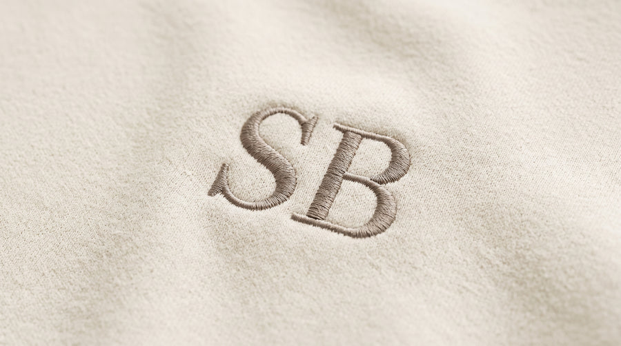
Understand why the centre letter can change the order
Cricut’s monogram guide describes two common conventions: equal-sized letters in first–middle–last order, and a larger centre surname initial with the first initial on the left and middle initial on the right.
For the fictional name Maya Rose Chen, those layouts would read M R C in equal-sized lettering, or M C R with the C enlarged in the centre. The letters represent the same person, but their visible sequence changes.
Treat these as layout conventions, not instructions to rearrange every name. If you prefer another sequence, say so explicitly. Most importantly, do not assume that typing your initials into a form guarantees how they will be positioned. Ask how the chosen design interprets the text.
Let the layout accommodate the name
A name does not have to fit a three-letter template. Someone with two family names may want both represented. Someone with no middle name may prefer two letters. A person who uses a single name may want one initial or the name itself.
For example, a wearer who chooses A, D and L to represent Alex Dubois-Lee should confirm whether they want three separate letters, a hyphen or a different arrangement. The maker should not have to decide which part of the name matters most.
If the desired letters do not work comfortably in a particular style, discuss a different layout rather than quietly dropping a letter. Your brief can also ask whether the chosen lettering supports the exact characters you need.
Check your letters, not only the sample alphabet
A monogram you love in a product photograph may use a very different combination from yours. Ask to see your actual letters together before settling on the style.
Look first for recognition: can you identify every letter without being told what it is? Then look at their relationship. Do you like them separated, touching or overlapping? Does one dominate more than you intended? An ornate arrangement may be beautiful, but you should still feel comfortable with how your own initials read.
Review the design at its proposed finished dimensions as well as enlarged on screen. Ask the maker whether a representative stitched example is available if you want a clearer sense of the lettering in thread.

Write a brief that leaves less room for guessing
A useful monogram brief has two parts: the meaning of the letters and their intended appearance. Here is an example for the fictional name above:
- Name represented: Maya Rose Chen.
- Visible sequence, left to right: M R C.
- Relative size: all three letters the same height; no enlarged centre letter.
- Style: separate upright capitals, with no connecting flourishes.
- Before approval: confirm the finished dimensions and placement on the selected sweatshirt.
If you prefer the enlarged-centre arrangement, write “M on the left, larger C in the centre, R on the right.” That description is clearer than “traditional monogram,” which leaves the maker to infer your intention.
Keep the approved preview with the written details. Our custom embroidery design guide covers the separate decisions about garment, placement and colour.
A small detail that feels entirely yours
The right monogram does not need the most letters or the most elaborate arrangement. It needs a name choice you are happy with and a layout you have actually checked.
Explore Saffron & Pine with your preferred initials in mind, then confirm the possibilities for your chosen piece. For more stitched details and design inspiration, follow Saffron & Pine on Instagram. A little clarity before approval makes a personal detail feel much more personal.