

Embroidery Lettering Layout: Should Your Phrase Be One Line or Three?
You have found the words. They sound right when you say them aloud and feel personal enough to wear. Then the design preview arrives, and one unexpected line break changes the whole mood.
An embroidery lettering layout decides more than where the words fit. It influences which word you notice first, where you pause and whether a phrase feels like a quiet note or a bold declaration. For Canadians planning a personalised sweatshirt, it is a small design conversation worth having before approval.
Start with the same words in a few arrangements. You may discover that the best change is not a different font or another colour—it is simply knowing where the next line should begin.
Hear the sentence before arranging it
Write your chosen phrase in ordinary text, with the spelling and punctuation you want. Read it aloud naturally. Notice which words belong together and where you instinctively pause.
Consider this original example: “Make room for small joys.” The phrase has a gentle rhythm, but different layouts can change its emphasis. Keeping “small joys” together preserves the final thought. Leaving “joys” alone gives that word more attention. Neither is automatically better; they offer different interpretations.
Before discussing appearance, decide which interpretation you want. Is the phrase meant to encourage, amuse, reassure or identify a group? A clear intention makes it easier to judge the options when the typography becomes more decorative.
Compare one line, two lines and a short stack
Try these three arrangements on paper or in a simple document. Keep the lettering style the same for now so you are comparing the layout itself.
- One line: “Make room for small joys.” This reads as one continuous thought and gives the design a horizontal shape.
- Two lines: “Make room” followed by “for small joys.” The pause separates the invitation from what you are making room for.
- Three lines: “Make room” followed by “for small” and then “joys.” The final word becomes a more distinct destination.
Read each arrangement from top to bottom without silently correcting it back into the sentence you already know. Does the wording still sound natural? Does a line feel unfinished in a way that distracts you?
A useful comparison keeps the intended design area visible. An arrangement that looks balanced on a full screen may feel quite different when you picture it as a compact chest detail.
Let alignment set the tone
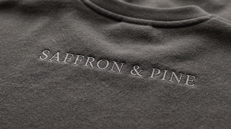
Once you have a preferred line break, compare centred and left-aligned versions. Centring can give a short stack the feel of a small emblem. A shared left edge can make it feel more like a written note.
Look at the actual words rather than choosing alignment by habit. If one line is much shorter than the others, centring may create a pleasing shape—or draw more attention to that short line than you intended.
For a personal message, try placing the shortest line at the beginning and then at the end, without changing the word order. Sometimes that means revisiting the line breaks. The exercise is to understand how the composition behaves, not to force every line to have the same width.
Avoid adding spaces between letters merely to fill an empty edge in your own mock-up. Describe the balance you want and let the design review resolve the spacing.
Choose one way to emphasise the important word
A phrase can become busy when several elements compete for attention. If one word matters most, first try giving it a line of its own. Then compare that with a version where every word receives equal treatment.
You can also ask to see a restrained change in size or lettering style, but introduce one change at a time. Otherwise, you may prefer an option without knowing whether it is the line break, the font or the colour doing the work.
For “Make room for small joys,” a larger “joys” might feel cheerful and expressive. An evenly sized two-line version might feel more private. Choose for the person wearing it, rather than assuming a more dramatic design is a more meaningful one.
Keep punctuation intentional too. A full stop, an exclamation mark or no final punctuation gives the same words a slightly different voice. Include the exact version in your written request.
Bring the layout back to the garment
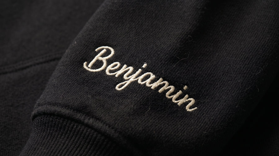
Now look at the design where you actually want it. A wide line and a compact stack occupy space differently, even when they contain identical wording. Ask for the proposed finished width and height, not only an enlarged image of the text.
Compare the layout with nearby garment features such as the neckline, pocket or cuff. If you are exploring a sleeve detail, check whether the whole phrase belongs there or whether a shorter message would better express your idea.
Keep your paper arrangement as a reference for meaning and composition. It does not establish whether every letter will work as embroidery at the chosen size. Ask the embroiderer to review the actual wording, lettering style, garment and dimensions together before treating the layout as final.
Approve the line breaks explicitly
Send the wording twice: once as a complete sentence, and once with each intended line clearly labelled. For example: Line one: “Make room”; line two: “for small joys.” Explain that the labels are instructions, not text to stitch.
Check that a messaging app has not introduced its own wrap and made the instruction ambiguous. In the final preview, review the line breaks, alignment, punctuation and overall dimensions together.
Our guide to embroidery proofs and stitch-outs can help you understand what your preview represents. Explore Saffron & Pine as you develop your personal wording, and follow Saffron & Pine on Instagram for more lettering inspiration. Give the words a little room, listen to how they read and choose the arrangement that feels like yours.